(Drawn from Statistics by Freedman, Pisani, Purves et al)
Suppose you are looking at the relationship between two variables, and have already plotted the scatter diagram. The graph looks like a cloud of points. How can it be summarized numerically? This is what the correlation coefficient does.
You already know how to summarize interval variables individually: you compute the mean and the standard deviation (SD). For example, to summarize the variable "GPA" for BC students you would just calculate the mean and the standard deviation, as in:
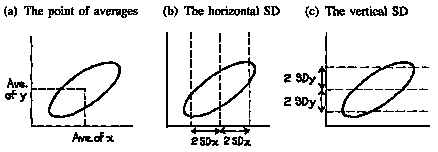
So, in the diagram below (Figure 4a), a first step would be to mark a point showing the average of the x-values and the average of the y-values. This is the point of averages. It locates the center of the cloud. The next step would be to measure the spread of the cloud from side to side. This can be done using the SD of the x-values. Most of the points (95%) will be within 2 horizontal SDs on either side of the point of averages (figure 4b). In the same way, the SD of the y-values can be used to measure the spread of the cloud from top to bottom. Most of the points will be within 2 vertical SDs above or below the point of averages (figure 4c).
Figure 4. Summarizing a scatter diagram.
So far, the summary statistics are
These statistics tell us the center of the cloud, and how spread out it is, both horizontally and vertically. But we still need to summarize the association between the two variables. Look at the scatter diagrams in figure 5. Both clouds have the same center and show the same spread, horizontally and vertically.
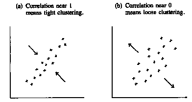
Figure 5. Summarizing a scatter diagram. The correlation coefficient measures clustering around a line.
However, the points in the first cloud are tightly clustered around a line: there is a strong linear association between the two variables. The correlation is quite high (the highest possible is 1.0, this is maybe about 0.8). In the second cloud, the clustering is much looser. When the clustering looks more like a circle than a football, the correlation is near zero. The strength of the association is different in the two diagrams. To measure the association, one more summary statistic is needed: the correlation coefficient. This coefficient is usually denoted r.
The correlation coefficient, r, is a measure of linear
association or clustering around a line. The relationship between two variables can be
summarized by:
|
The formula for computing r will be presented later. Right now we want to focus on the graphical interpretation.
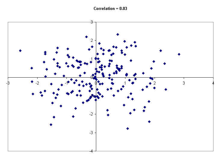
Following this paragraph are a number of scatter diagrams generated by computer using 200 hypothetical data points. The computer has printed the value of the correlation coefficient at the top of each diagram. The first diagram (below) shows a formless, circle-like cloud. The correlation between those two variables is just about zero. You can see that small values of X have all kinds of Y values -- small, medium and large. So do medium values of X, and so do large values of X. In short, the Y values are not related to the X values. Knowing the X value for a given point does not help much to predict the Y value.
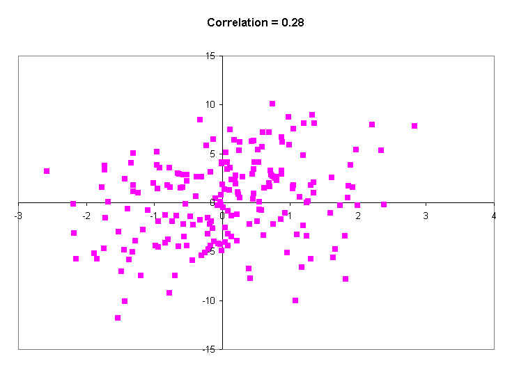
The next scatter diagram has a little more of an elliptical shape. The average Y value for points with small X values is lower than the average Y value for points with large X values. The correlation is r = 0.28.
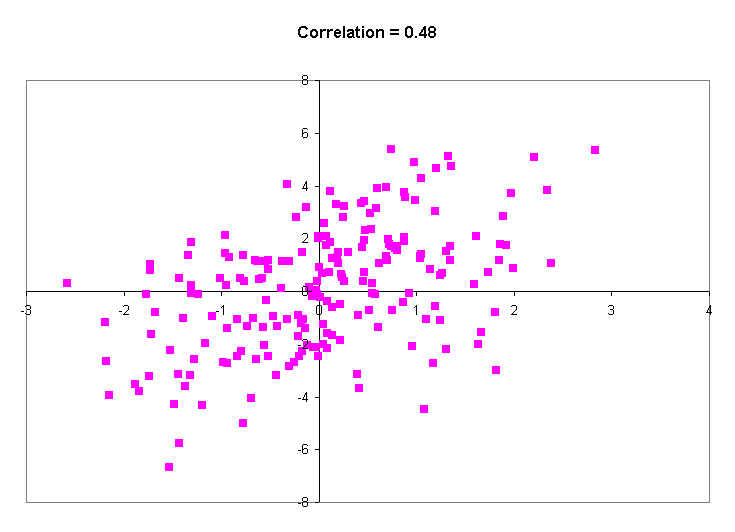
The next diagram (below) shows a correlation of about 0.48. This is just a little higher than the correlation between income and education is in the United States. That means that, on average, people with more education make more money.
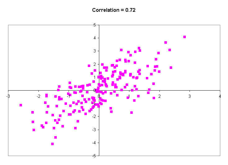
The next diagram shows a much stronger correlation (r = 0.72). The band is getting quite narrow, and big X values show much higher Y values than do small X values.
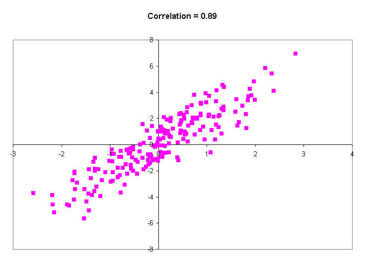
Then next diagram has a really high correlation of 0.89. This is just a little less than the actual correlation between the heights of identical twins of all ages. Note that even with a correlation of 0.89, you don't really expect the twins to have exactly the same height: almost always there is SOME difference. All this really says is that on average, the difference is small. Occasionally, though, there will be some big differences.
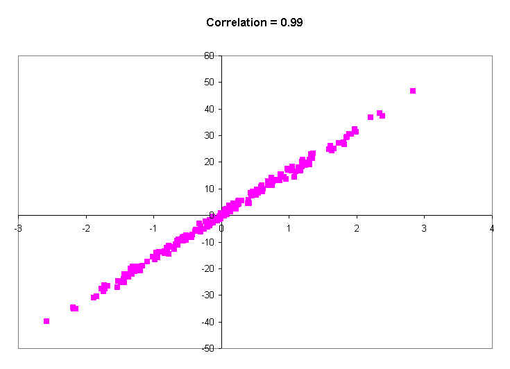
The last picture shows a correlation of 0.99. You will probably never see a real correlation that big. It's practically a straight line. Knowing a person's X value tells you their Y value to within a couple of decimal places of accuracy. In other words, virtually every person with a certain X value (say, 0.5), has practically the same Y value (around 0.8).
So what am I saying?
So far, only positive association has been discussed. In the United States, women with more education tend to have fewer children. This is negative association. An increase in education is accompanied on the whole by a decrease in the number of children. (What are they learning in school?!) Negative association is indicated by a negative sign in the correlation coefficient. A correlation of -0.90, for instance, indicates the same degree of clustering as one of +0.90. With the negative sign, the clustering is around a line which slopes down; with a positive sign, the line slopes up. For women of childbearing age in the United States, the correlation between education and number of children is around -0.2; not strong, but there.
Correlations are always between -1 and +1, but can take any value in between. A positive correlation means that the cloud slopes up; as one variable increases, so does the other. A negative correlation means that the cloud slopes down; as one variable increases, the other decreases.
A correlation of, say, r = 0.80 does not mean that 80% of the points are tightly clustered around a line, nor does it indicate twice as much linearity as r = 0.40. The correlation measures the extent to which knowing the value of X helps you to predict the value of Y.
Suppose you wanted to predict the GPA of a random BC student, and you knew what the average GPA for all BC students was 2.9. Then you would just guess the 2.9. Why? because the average of a list of numbers is the value that is least different from all the others. Look at the table below. The column labeled X has a set of 10 values. The sum is 140, and the average is 14. The next column over computes the (squared) differences of each value in X from 14. The average difference is 115.8. The next three columns compute the difference of each in X from different values, such as 12, 11 and 17. Notice that the average squared difference is smallest for 14, the average. It's always this way: the average is that value that is least different (in terms of squared differences) from all the numbers in a list. So the average is your best guess of the GPA of a random student.
X |
(X-14)2 |
(X-12)2 |
(X-11)2 |
(X-17)2 |
|
1 |
1 |
169 |
121 |
100 |
256 |
2 |
3 |
121 |
81 |
64 |
196 |
3 |
6 |
64 |
36 |
25 |
121 |
4 |
6 |
64 |
36 |
25 |
121 |
5 |
7 |
49 |
25 |
16 |
100 |
6 |
13 |
1 |
1 |
4 |
16 |
7 |
17 |
9 |
25 |
36 |
0 |
8 |
27 |
169 |
225 |
256 |
100 |
9 |
30 |
256 |
324 |
361 |
169 |
10 |
30 |
256 |
324 |
361 |
169 |
Total: |
140 |
1158 |
1198 |
1248 |
1248 |
Average: |
14 |
115.8 |
119.8 |
124.8 |
124.8 |
But suppose you knew that female students have a higher GPA than male students (by, say, 0.20 gpa points). If you knew the sex of the random student, you would adjust your estimate up or down depending on the sex. This should mean that, on average, your guesses would not be as far off as if you just guessed 2.90. The more sex is related to GPA, the more knowing someone's sex improves your guesses.
Suppose you are trying to guess a randomly chosen person's height. Your best guess is the mean height. But if you knew what what shoe size they wore, you could do a much better job of guessing: you would guess the average height of people with that particular shoe size.
The correlation coefficient tells you how many standard deviations above the mean on the Y variable most people are (on average), given that they are one standard deviation above the mean on the X variable. If the correlation is 1.0, it means that for all persons that are 1 SD above the mean on X, the average value of Y is 1 SD above the average of Y. If the correlation is 0.8, it means that on average, people 1 SD over the mean on X are about .8 SDs above the average of Y.
If the correlation is 0.0, it means that the average Y value for people 1 SD over the average on X is just about 0 SDs over the average of Y, which means that it is just the average of Y. In other words, when there is no correlation between X and Y, you just predict the mean of Y, ignoring the value of X.
Step 1. Convert the X and Y variables to standard units. Call the results X* and Y*. To do this for X, subtract the mean of X from each X value, then divide each deviation by the standard deviation. About 95% of the resulting values will lie between -2 and 2. The mean of the new variable, X*, will be zero, and the standard deviation will be one. For example:
ID |
X |
X* |
Y |
Y* |
XY |
1 |
1 |
-1.1461 |
3 |
-1.0302 |
1.1807 |
2 |
3 |
-0.9697 |
2 |
-1.1332 |
1.0989 |
3 |
6 |
-0.7053 |
5 |
-0.8242 |
0.5813 |
4 |
6 |
-0.7053 |
6 |
-0.7211 |
0.5086 |
5 |
7 |
-0.6171 |
11 |
-0.2060 |
0.1272 |
6 |
13 |
-0.0882 |
13 |
0.0000 |
0.0000 |
7 |
17 |
0.2645 |
12 |
-0.1030 |
-0.0272 |
8 |
27 |
1.1461 |
27 |
1.4423 |
1.6530 |
9 |
30 |
1.4105 |
25 |
1.2362 |
1.7438 |
10 |
30 |
1.4105 |
26 |
1.3393 |
1.8891 |
Total: |
140 |
0 |
130 |
0 |
8.7552 |
Average: |
14 |
0 |
13 |
0.000 |
0.876 |
Std Dev: |
11.343 |
1.00 |
9.71 |
1.00 |
0.74 |
Step 2. Multiply corresponding values of the standardized X and Y variables (X* and Y*).
Step 3. Take the average of the products computed in step 2. That is the correlation. In the example shown, the correlation is 0.876.
1. (a) Would the correlation between the age of a second-hand car and its price be positive or negative? Why? (Antiques are not included.)
(b) What about the correlation between weight and miles per gallon?
2. For each scatter diagram below:
(a) The average of x is around 1.0 1.5 2.0 2.5 3.0 3.5 or 4.0 ?
(b) Same, for y.
(c) The SD of x is around 0.25 0.5 1.0 or 1.5 ?
(d) Same, for y.
(e) Is the correlation positive, negative, or zero?
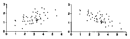
3. For which of the diagrams in the previous exercise is the the correlation closer to 0, forgetting about signs?
4. In figure 1 of The Scatter Diagram, is the correlation between the heights of the fathers and sons around -0.3, 0, 0.5, or 0.8?
5. In figure 1 of The Scatter Diagram, if you took only the fathers who were taller than 6 feet and their sons, would the correlation between the heights be around -0.3, 0, 0.5, or 0.8?
6. If women always married men who were five years older, what would the correlation between their ages be? Why?
7. The correlation between the ages of husbands and wives in the U.S. is:
Why did you give the answer you did?
8. Investigators are studying registered students at the University of California. The students fill out questionnaires giving their year of birth, age (in years), age of mother, and so forth. Fill in the blanks, using the options given below, and explain.
(a) The correlation between student's age and year of birth is
(b) The correlation between student's age and mother's age is:
9. True or false: If the correlation coefficient is 0.90, then 90% of the points are highly correlated.
1. (a) Negative. The older the car, the lower the price.
(b) Negative. The heavier the car, the less efficient.
2. Left: ave x = 3.0, SD x = 1.0, ave y = 1.5, SD y = 0.5, positive correlation.
Right: ave x = 3.0, SD x = 1.0, ave y = 1.5, SD y = 0.5, negative correlation.
3. The left diagram has correlation closer to 0; it's less like a line.
4. The correlation is about 0.5.
5. The correlation is nearly 0. Psychologists call this "attenuation." If you restrict the range of one variable, that usually cuts the correlation way down.
6. All the points on the scatter diagram would lie on a line sloping up, so the correlation would be 1.
7. Close to 1; this is like the previous exercise, with some noise thrown into the data.
Comment. In the March 1988 Current Population Survey, the correlation between the ages of the husbands and wives was 0.95.
8. (a) Nearly - 1: the older you are, the earlier you were born but there is some fuzz, depending on whether your birthday is before or after the day of the questionnaire.
(b) Somewhat positive.
9. False.
This lecture largely drawn from Statistics, by Freedman, Pisani, Purves and Adhikari
| Copyright ©1996 Stephen P. Borgatti | Revised: October 07, 2010 | Home Page |